Metal Hammer Redesign 2018
Magazine: Metal Hammer
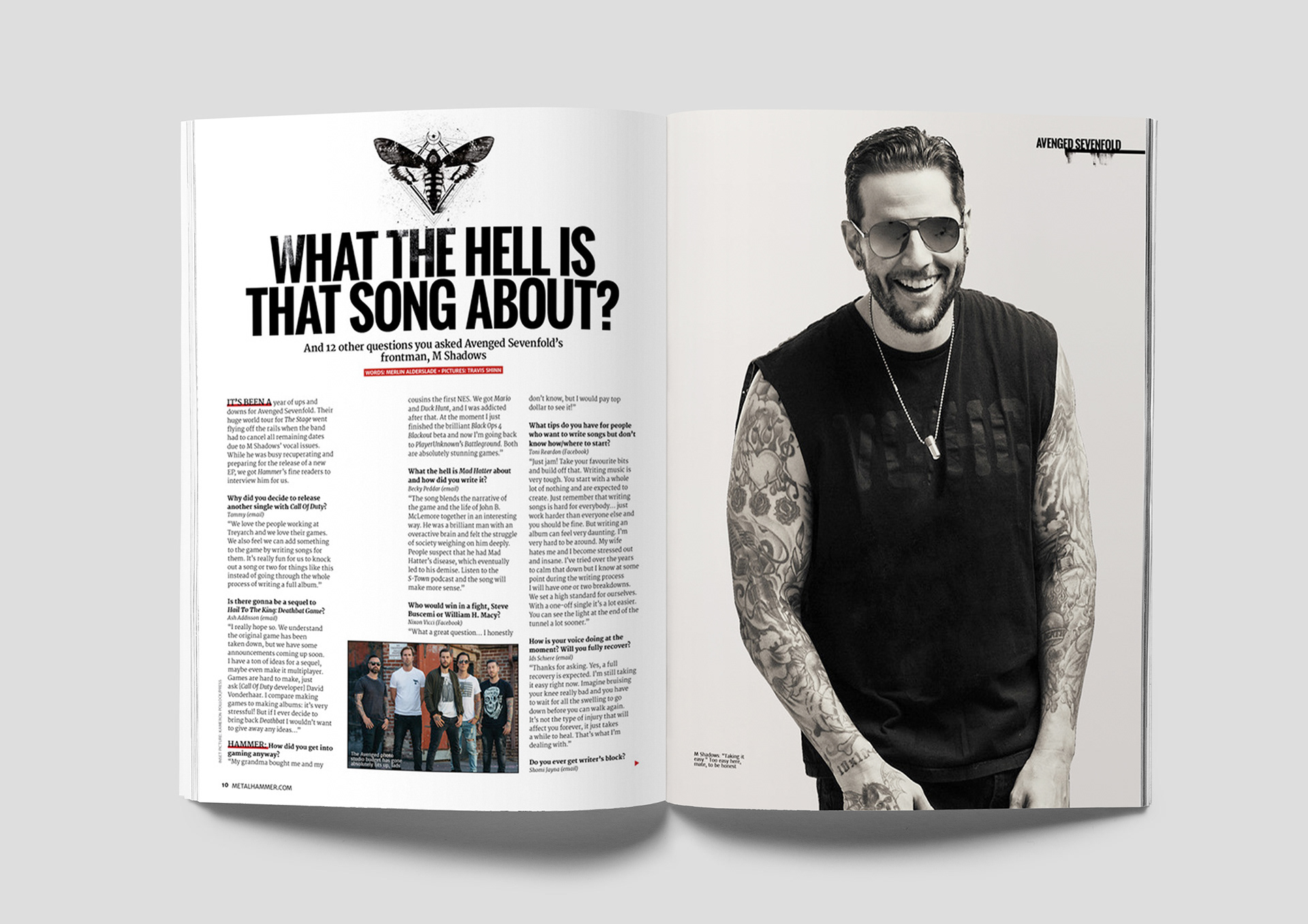
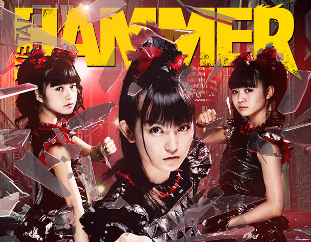
In 2018, as Art Editor of Metal Hammer, one of the most trusted and iconic brands in rock and metal, I was tasked with giving the magazine a fresh, modern look. The brief was to evolve the brand for a new phase while staying true to its rock and metal roots.
Working closely with the editorial team, I helped reimagine the magazine to meet the changing needs of both the industry and our readers. The redesigned Metal Hammer emphasises bigger, more engaging stories, high-quality writing, premium design, and exclusive extras.
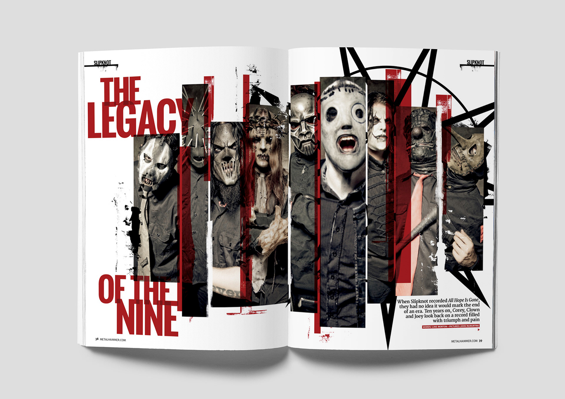
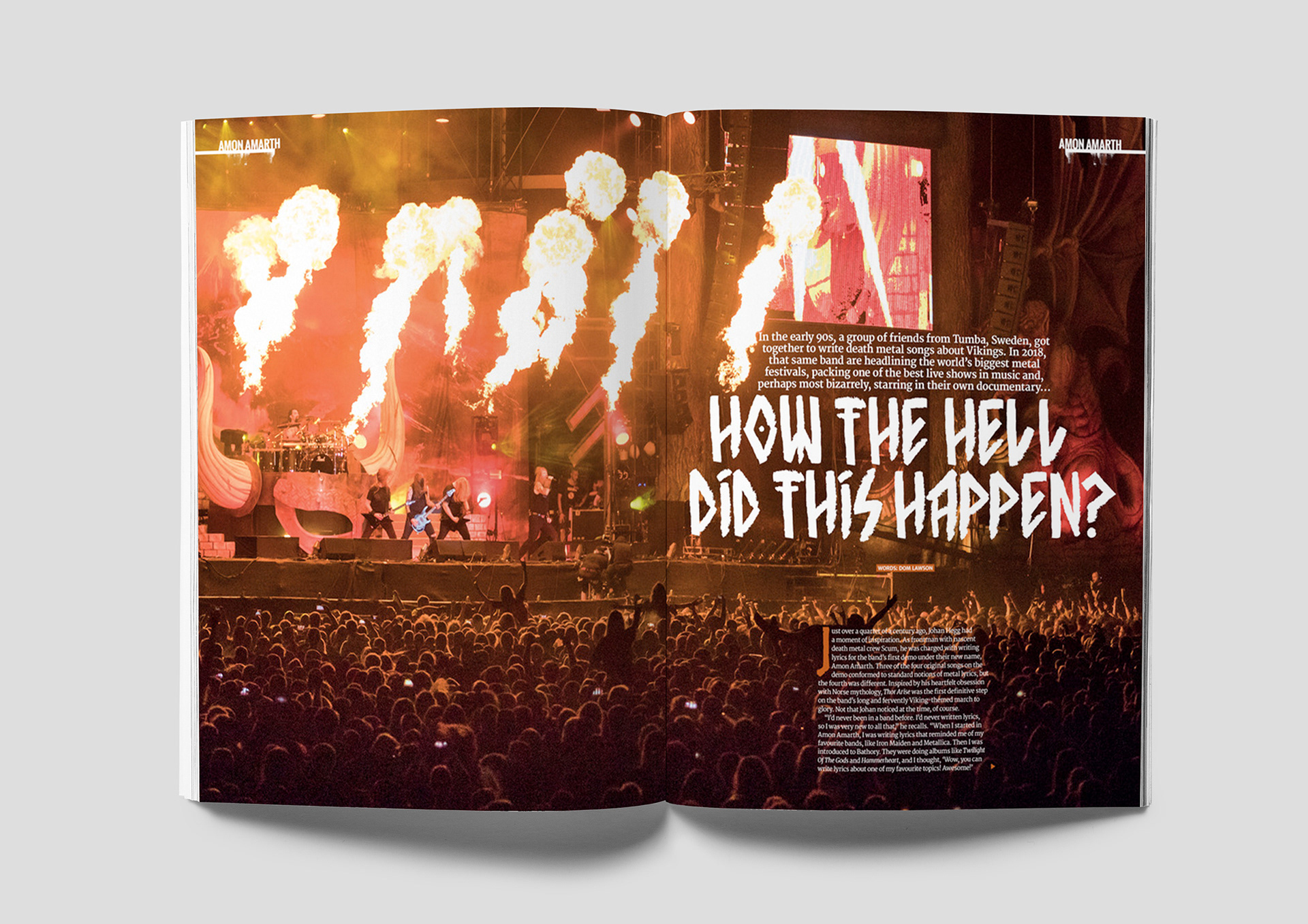
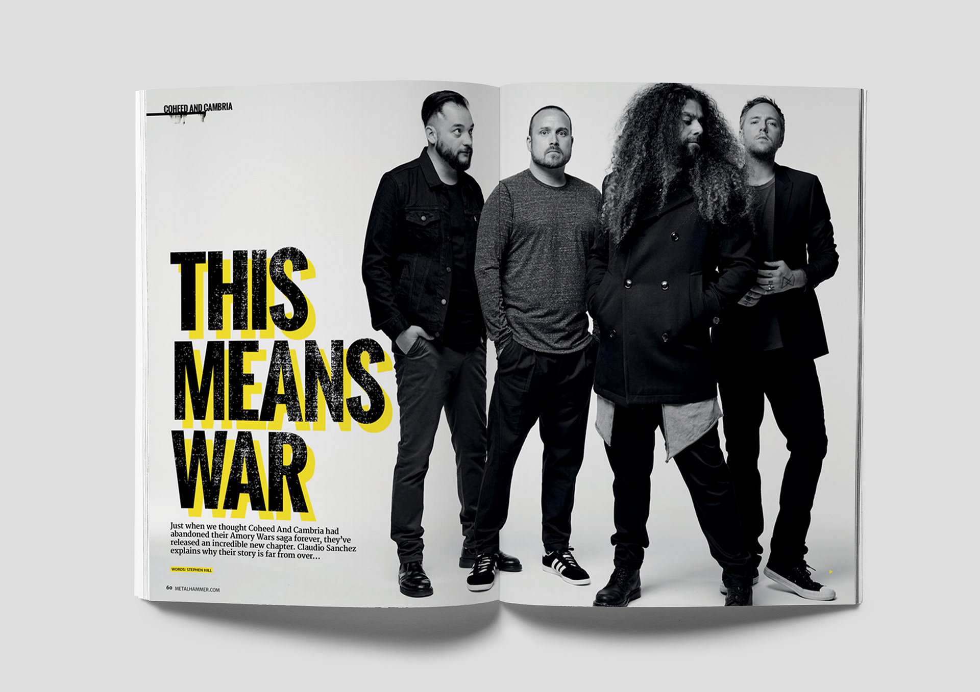
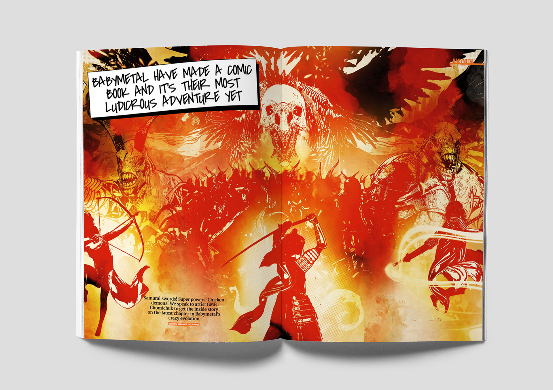
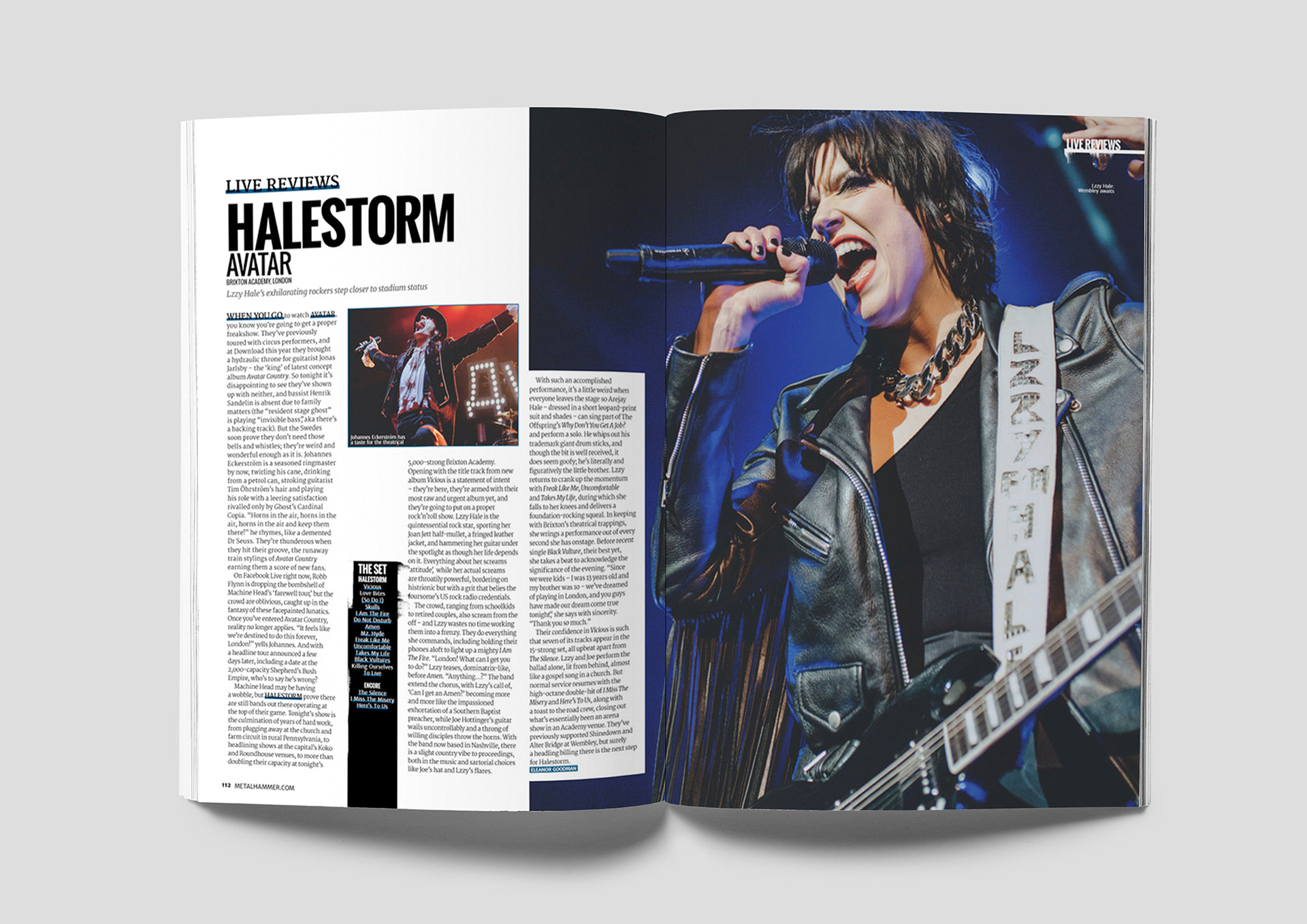
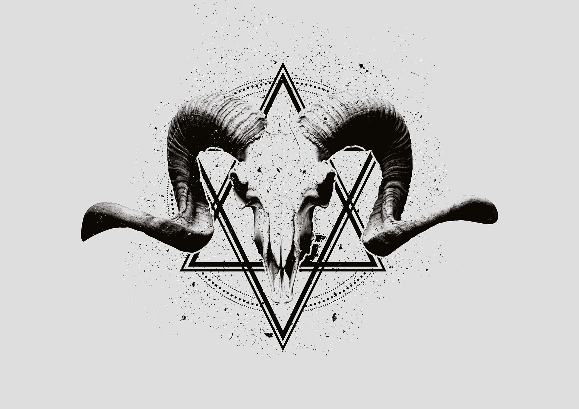
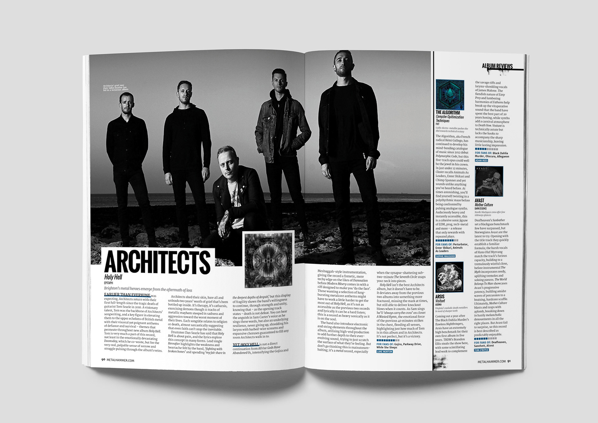
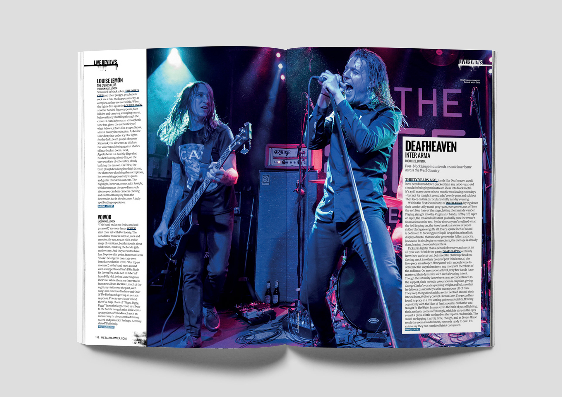
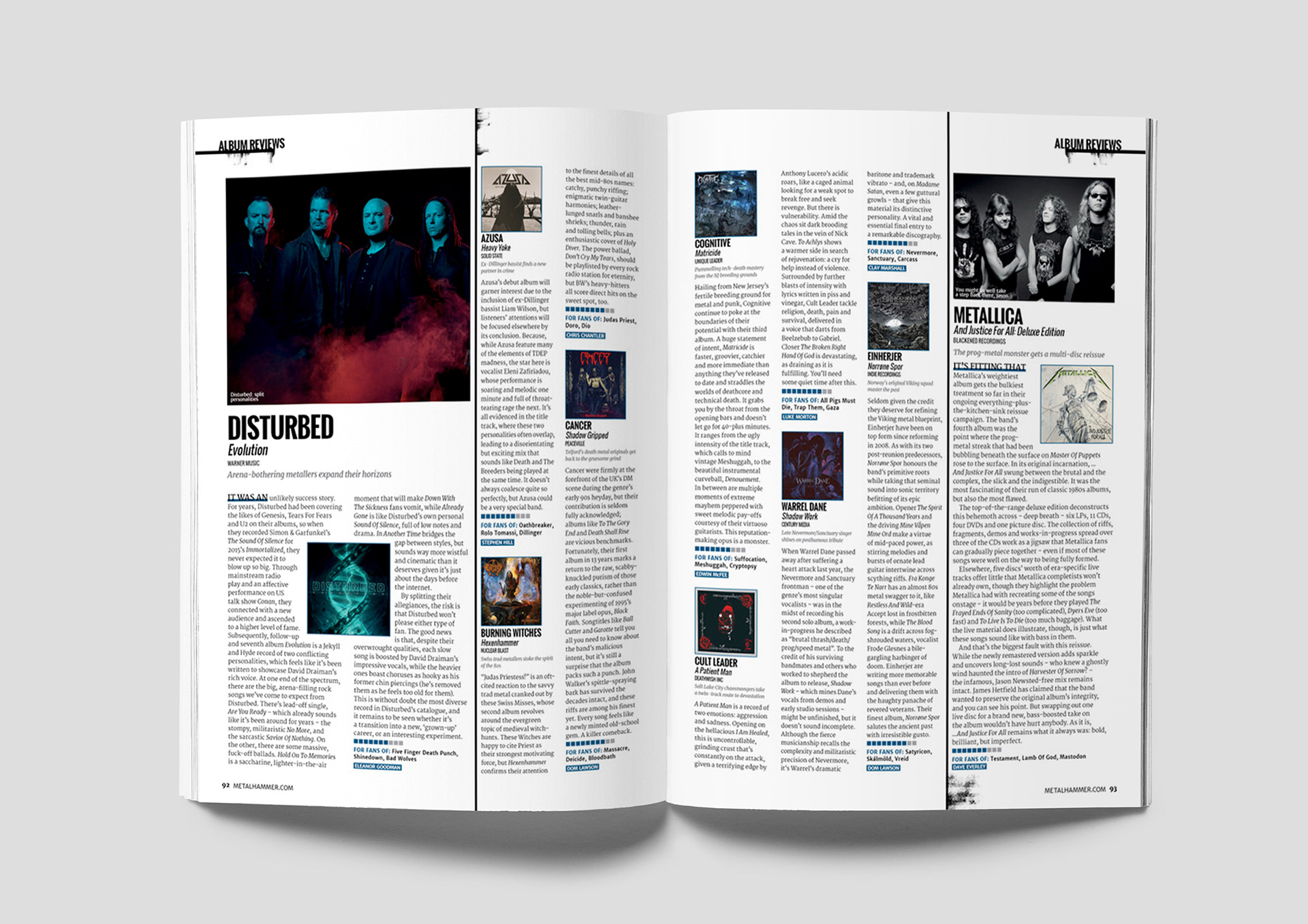
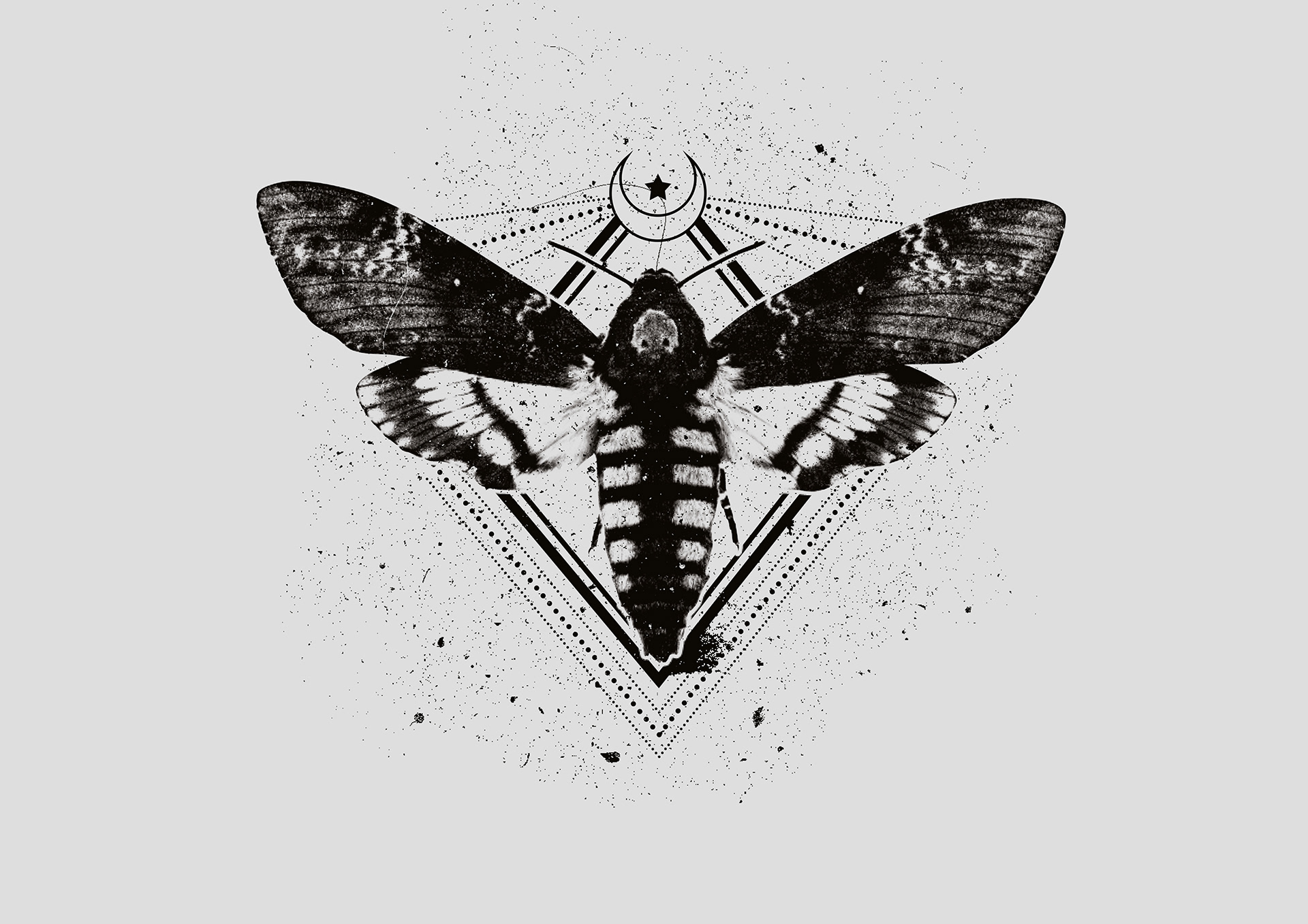
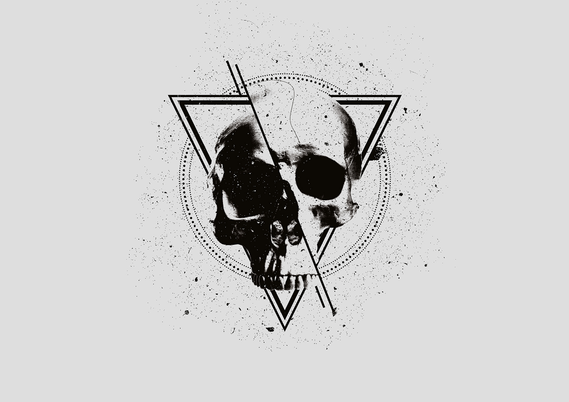
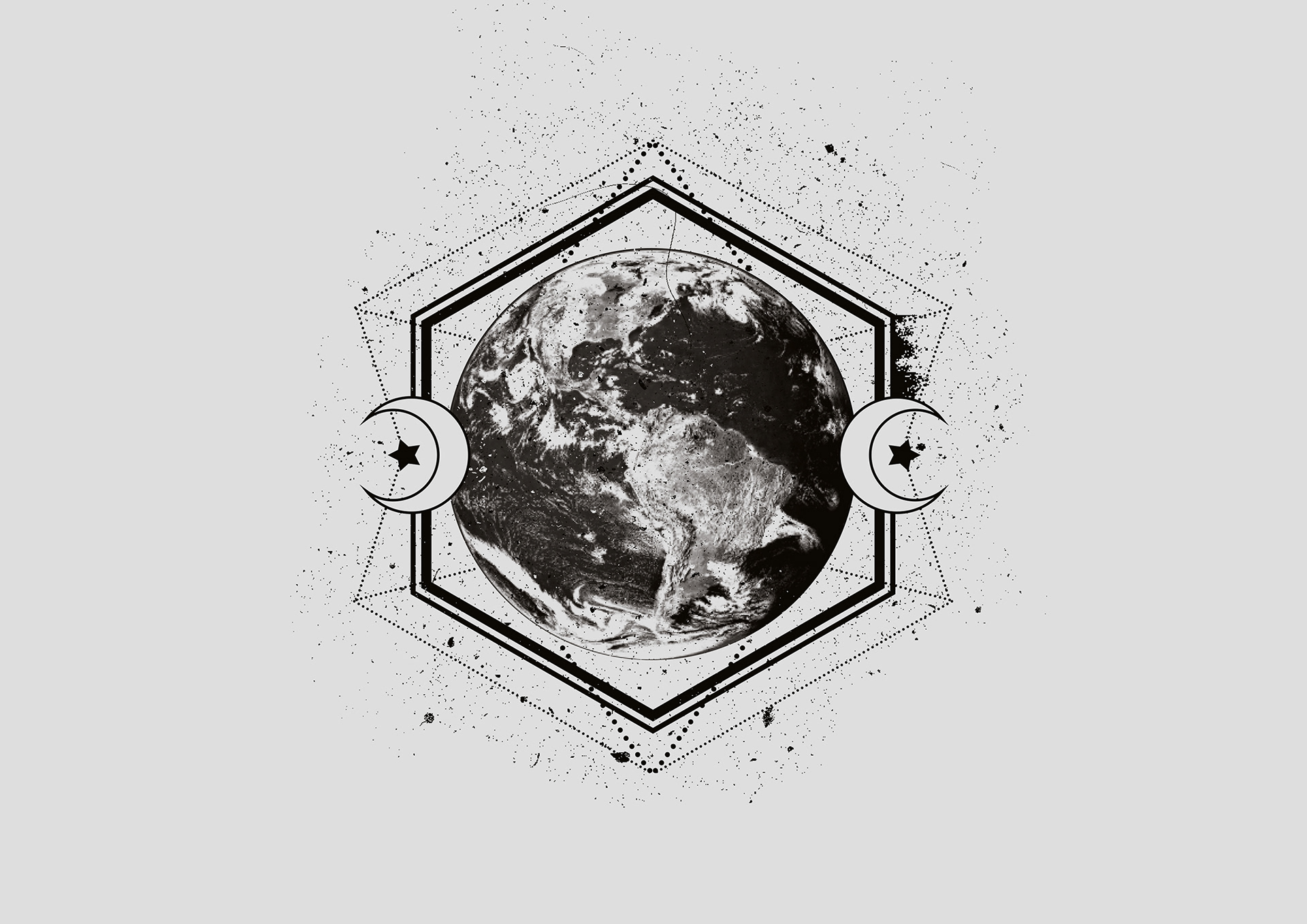
After several weeks of concept development, I created a magazine aesthetic that complemented the editorial content. Modern fonts, strategic white space, and a renewed focus on grids and structure provided a clean, contemporary feel while maintaining flexibility for creative work on covers and features. Feature spreads were designed with bold openings, large imagery or typography, to draw readers in, and overall image sizes were increased to showcase the work of talented photographers and illustrators.
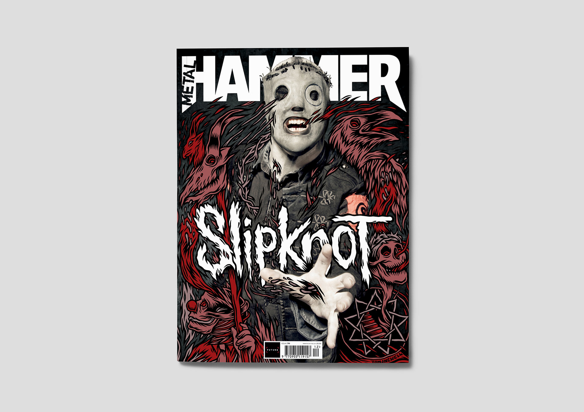
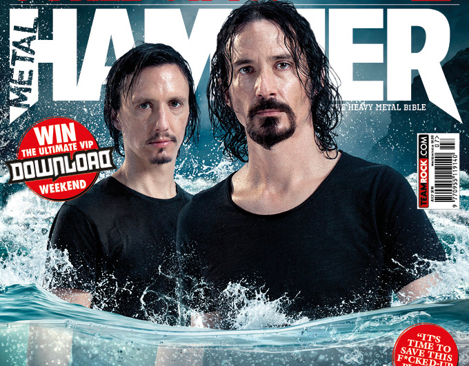
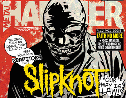
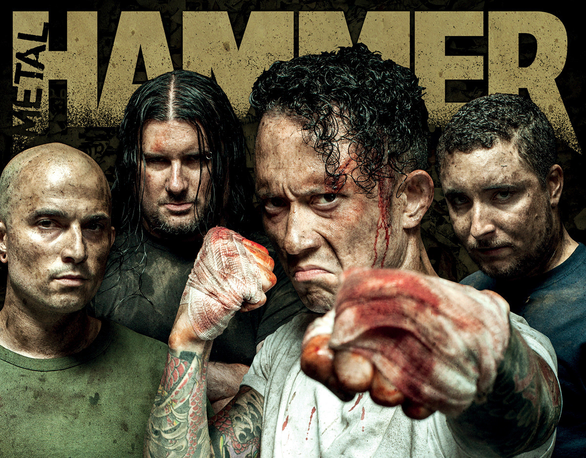
The first issue of the redesigned magazine featured Slipknot on the cover, combining a classic John McMurtrie photograph with an exclusive illustration by Tom J Newell. Readers received an exclusive poster by Mark Van De Beek, a book of Slipknot quotes, and a 15-track CD. This issue saw a significant rise in sales, a trend that has continued beyond my time at the magazine.
Software Used: Adobe Illustrator, Adobe Photoshop, Adobe InDesign